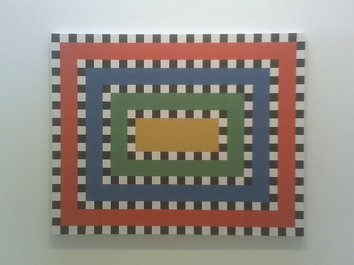
Stephen Westfall at Lennon Weinberg - I liked every single one, but none of them quite as much as Dogwood, the piece I saw here last summer. I think because Dogwood made me think of Japan.
Jason Fox at Feature - Jason Fox kicks ass. This was so cool to see right after seeing the Stephen Westfall paintings next door. This painting is in the back and the guy let me look at it, and even pulled out a bigger older one that Fox had painted on the back of a Meyer Vaisman (they are former studio mates).
Everything at Feature was good - the current show in the front room is Lucky DeBellevue; James Wagner has a beautiful photograph here. The paintings are like something from Maurice Tuchman's The Spiritual in Art. Tyler Vlahovich is in the back room with interesting work.
Louise Fishman at Cheim & Read - I really liked seeing the little sailboat De Kooning homage in this painting. That's what it is, right? That's how I read it, anyways. Didn't like all of these paintings, some of them got to thick with brushstrokes and flattened themselves out or something. My favorite was in the back room, on the wall on the right. Can't find an image but it was called Ramon De La Vida Loca - it had a lot of variety of strokes and direction and action, and the space was the best. The lightest part was farthest away, the darkest parts closest; and the far away strokes were the sharpest, with the closest the blurriest. There was a big sweep coming down from the top, a little left of center. Like a gauzy curtain.
Lots of Louise Fishman talk on PaintersNYC and at Edna's.
Alison Fox at Sikkema Jenkins - Another sailboat, maybe(?). Okay, I have now seen enough Alison Fox paintings to know that I generally like them, and in this show she and Paula Wilson were my two favorites, although I didn't like the Fox image that was chosen for PaintersNYC at all, too cake-y. I like her colors and designs, sense of structure, and the seemingly casual brushwork. Some of these paintings get very complicated but they don't become weighted down (except for that cakey one).
The Paula Wilson's were freaky. On some of them all of the crinkly paper add-ons kind of got in the way for me, but on this big butt face one it works well.
The Matt Connors and Mark Handelman were both just completely blah for me, and Chris Dorland's stuff I always find boring for some reason, but not necessarily badly painted. Not sure what it is... the monochrome, the stifling feeling, the sterile settings? Can't get into them or get anything out of them.
They talk about this whole show on Fairy Butler's blog, lots of different thoughts in the comments. Most of them didn't like Fox's paintings, and did like Connors'.

No comments:
Post a Comment